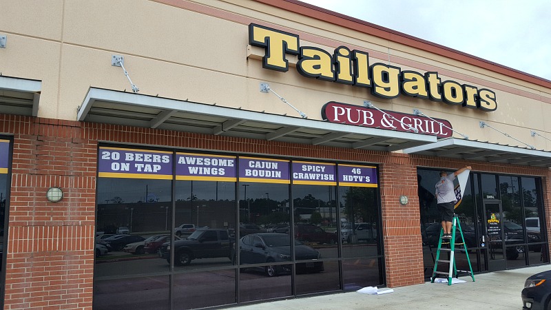
For every business sign, the goal is to be effective and stand out while still being legible. However, that goal is much easier stated than achieved. While it takes a lot of planning and some considerations, the goal is achievable. The big three to keep in mind are legibility, clarity and visibility.
For legibility, the biggest aspect is finding the right font. For clarity, you will need a mix of good space balance and a crisp look. For visibility, it is more focused on how large the letters are and from how far away you are aiming to market. Before starting your design, it’s important to consider how your audience will view your sign. For instance, if you will be marketing to motorists on a highway that is a bit far from the physical location, the font and size choices for channel letter signs will differ from those that will be seen from a street that passes by or pedestrians.
To best market your business, keep the following principles in mind during design.
Letter Case
While many type emails in all capital letters to have less strain on their eyes while on the computer, the same should not be true of channel letter signs. Having letters in the same case actually makes signs harder to read. The difference in height and shape makes signs much easier to read as the brain can better differentiate the individual letters from one another.
Reading Distance
From where will your audience view your sign? If the roadway passes by your location, the letters won’t have to be as high. If you are targeting commuters on a major highway, they should be bigger. Reading distance is also influenced by the font and color of the letters. If your letters are in a bolder font with good contrasting colors, you can have a bit less height without sacrificing readability.
Font Selection
While fonts will often be determined by existing branding information, some fonts work much better than others. For instance, the fancier looking fonts may communicate a type of branding, but a lot can be lost in translation as they are much harder to read. Some examples of legible sans serif fonts include Arial, Calibri, Century Gothic and Verdana.
If you aren’t sure where to begin, contact us today. Our team has the knowledge to properly guide you through the process of choosing the right typeface and sizing to best communicate your brand.


Recent Comments