by | Oct 20, 2017 | Industry News
Business signs can do more for a brand than most business owners realize. They can reinforce the branding efforts you have already made and create a conversation and awareness about your company and brand. They can help your marketing efforts, let customers know where your physical location is, and also get the attention of passersby which can lead to better visibility and higher knowledge in the community of what you have to offer. However, the wrong sign can hurt your company. If your signage is misleading or looks outdated, it can send the wrong message about your company. Signage is an immediate and direct product of your company even if you didn’t make the sign yourself. So how can a business owner use this to their advantage rather than their detriment? High-Quality Materials The last thing you want is to have the first impression of your company be cheap materials. If you have a dingy sign or use materials that are clearly cheaply crafted, it will send the message that your company is not concerned with details and is willing to sacrifice quality to save a buck. In most cases, the higher quality materials aren’t much more as an upfront cost. Even better, they tend to save business owners over time since there will be less maintenance needed. This means less time spent but a better product overall. Color Color can say a lot about a company. Not only does a good sign give an opportunity to reinforce your brand colors, it can show off your creative side. While most will want to lean toward sticking with the more...
by | Oct 13, 2017 | Industry News
When your exterior business sign has seen better days, it’s not always necessary to start over completely. There are solutions that can address the issues you are having from broken lights to a sign that looks outdated without starting from the beginning. Of course, starting anew could also be a great option, especially when you have gone through a rebranding or your images are looking like they’re from another decade. Whatever your issues, there are three approaches that will leave your storefront looking refreshed, whether you want to work with what you have or start over. Upgrade Old Styles If your sign uses old technology, they can be retrofitted. This is particularly helpful for signs that are still using backlighting with neon or fluorescent lighting, but still have the look and feel a company enjoys. The old lighting components are taken out and replaced with longer-lasting LED lights that save on energy consumption and give a more consistent lighting effect. Even better, they are often brighter which will lead to much better visibility at night or on overcast days. Refurbish or Repair If your sign is broken, you don’t necessarily need a whole new sign. Instead, look for services that fix what you already have through refurbishing or repair work. Faded out letters can be replaced with new sign faces rather than getting a whole new sign. In other cases, such as broken bulbs or panels, new components can be added once the old ones have been stripped away. This keeps the look you like while giving a fresher feel. Remove and Replace If your sign has a lot...

by | Oct 4, 2017 | Industry News
When you get people to come into your booth at a trade show, your job has only just begun. After all, you don’t want to waste precious time at a sales event on people that aren’t ready to make a purchase or are only “window shopping,” so to speak. But how do you identify who is ready to make a purchase and who is just seeing what is going on at the event? Using more traditional sales efforts can be invaluable. Asking the right questions lets your sales team know whether they should try to convert the lead into a sale, or if they should just explain the product and leave them with the right materials to later make the purchase if they so choose. What have you tried in the past? Why didn’t it work? Whether you are selling a product or a service, customers will be interested in buying what you offer to address a specific need. Identifying their troubles in the past will better inform the conversation and make it easy to individualize their buyer’s journey. However, it will also clue you into how serious they are about purchasing your product. If they haven’t tried many products and can’t identify why they didn’t work for them, it’s unlikely they are trying to buy right away. Do you have a specific budget? From personal life solutions to business purchases, everyone has a price point. If their price point is far below what your services or product sells for, or they have no idea what the budget will be, they are unlikely to be a good lead. If...
by | Jul 27, 2017 | Industry News
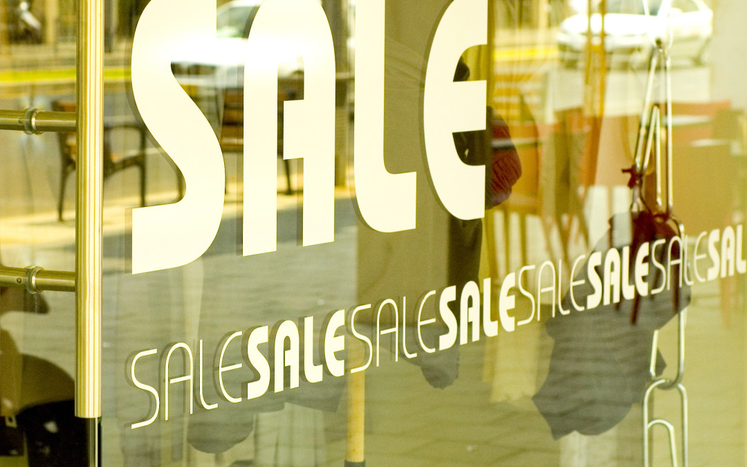
Window graphics open a lot of opportunities for retail stores. They can showcase sales, promotions or give more exposure for your brand. From getting attention from passersby to letting customers know the current sales, a lot can be gained while staying on a budget. Depending on the intent of the message, there are plenty of ways to use graphics to communicate with potential customers. Keeping your intent in mind is an important rule of thumb. Without outlining what you hope to achieve ahead of time, creating graphics for a display can be overwhelming. Instead, consider what you want passersby to learn by looking at your window. If it’s the current sale, be sure to have your biggest sales prominently displayed. If it is simply getting attention for your brand, put your logo and company information at the center of the design. Be sure passersby can see a call to action, such as a website or social media account to look at. Once you know what you want to put on display, there are a few simple tips on design. Get Interactive While it may be a static image, there are still ways to interact and engage with those who see your display. Adding motion, such as moving character or directional images, can improve the look of a display while also getting customers to the door. Designing in a way that puts direction with your sales is one of the surefire ways to get someone in the front door. Creativity is Key While simplicity is good in design, being too simple won’t get attention. Sticking with bold text and little...
by | Jul 20, 2017 | Industry News
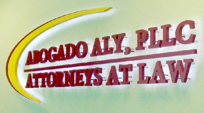
Three dimensional letters are a common selection for building signs and for good reason. They showcase the name and look of a company without extra muss and fuss, all while having the illumination and non-illuminated options to make a fully customized sign. Even better, both options can be outfitted in any color selections, leading to an exact match to the logo specifications for each company. However, the right three-dimensional letters make a huge difference. The type of sign, material, style, thickness and design makes a huge impact on the effectiveness and look of the sign. Depending on your goals and the specifications of your logo and lettering, there are a few types of three-dimensional letters to choose from. Two Main Types of Lettering While there are many different types of lettering, there are two main types nearly all three-dimensional letters fall into: Dimensional. This is what they are called when they are not illuminated. This type of lettering is bold, clear, distinct and the easiest to read. These letters can be used both as exterior signage and for interior signage, such as lobby signs. Channel Letters. These are the most common selection when a sign will be illuminated. They are internally lit and have many different lighting effect choices to fit the needs of the business. This is a common choice as they can be seen easily both during the day and at night. Styles of Letters Lettering for signage can also be done in different styles, making each sign unique for the brand. Some style options include: Illumination. Signs can be lighted or non-illuminated in a variety of different settings...
by | Jul 5, 2017 | Industry News
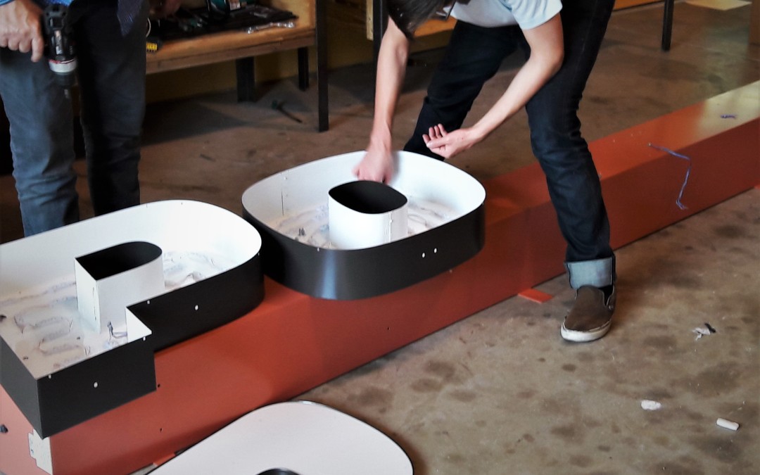
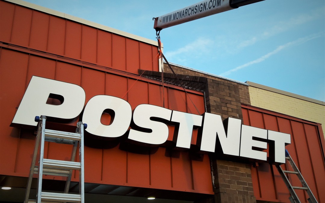
At a local networking event, our team at Monarch Sign & Graphics met the owner of PostNet Tomball. Up until the event, PostNet Tomball was only able to find corporate suppliers. Eric, the owner, was excited to find a locally owned sign shop as a local business owner himself. We discussed our capabilities at Monarch Sign & Graphics for a few minutes, after which he knew he had found the right sign company for his company’s needs. Before starting any project, we always start by discussing our abilities and what the company is looking for in a sign company. By starting off with a personal consultation, we’re better able to meet expectations before the first considerations for the signage are even made. Channel Letter Sign For the project, it was decided a front lit illuminated channel letters sign would be the best option to get the most exposure for the business. These letters are mounted onto a raceway to achieve their look. We crafted the letters with aluminum returns, which are the sides of the letters. The backs were custom-made with an acrylic face. To get the most out of the investment and lower monthly electric bills, we used LED lighting for the illumination. Compared to neon, LED lighting uses 80% less electricity. We also recommend LED lighting because it is known to be virtually maintenance-free, leading to lower costs and time commitment for our customers overall. Mounting the Raceway With every signage project, there are unique challenges. For these channel letters, the design of the store front posed the biggest trial. In the middle of the storefront was...


Recent Comments