by | Apr 27, 2017 | Recent Projects
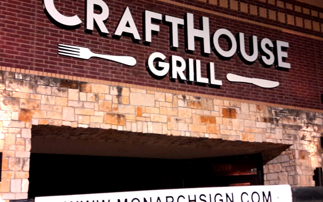
CraftHouse Grill has opened a new location at 12910 Malcomson Road, Houston, at the former site of Kilburn’s Tavern. The restaurant boasts options in craft burgers and beers, aiming for a relaxed neighborhood environment. For the new location, the team was looking for an illuminated building sign. The first step of the process was removing the existing Kilburn’s Tavern & Grill sign. Once our professional installers had removed all elements of the sign, we completed an in-depth survey of the building. The site survey is one of the most important steps in creating a new sign that is built to last. Our team took measurements to properly scale the building to size, giving a much more accurate idea of how to create the proposed sign. At this stage, it is also advised owners of the building consider giving a fresh coat of paint to the building. This helps keep everything consistent and gives a fresher end result. For the new sign, our team recommended individually mounted channel letters that use internal LED illumination. Our LED solutions have been known to reduce energy consumption by 80% while remaining virtually maintenance-free. To get the most use out of the sign, we fabricated the sign with all aluminum construction and used acrylic faces. The aluminum is known for its ability to stand the test of time without rusting or corroding, leading to many years of use. To achieve a professional and clean look, our team ran all the wires from the inside of the letters through the face of the building. The holes created to allow the wires to run through the...
by | Apr 20, 2017 | Industry News
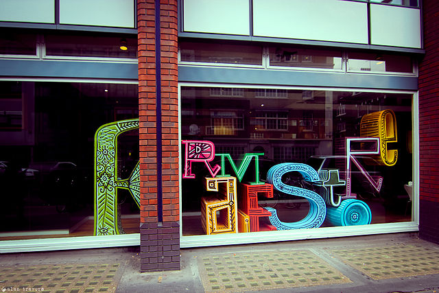
Optimal signage can be as simple as finding the right images to complement your wording. Having graphic images can drive up intrigue and make for a better long-term investment in your business signs. Whether you are adding a logo box to a channel letter sign or designing a lightbox sign, images can communicate a lot about your brand while best utilizing the space you have. Text is important. Having your business’s name easy to find is imperative to bringing customers in that are looking for your location. However, images can be the tool to get potential customers in the door. Someone who is looking to have their computer fixed is far more likely to choose the business with a computer in its sign. This is because it is an obvious and predictable connection. While color, design and shape options are virtually endless, there are some quick tips to make choosing aspects of your signage much easier while remaining on point with your branding specifications. Graphic Images In a study conducted at the University of Cincinnati, there was a poignant survey question regarding signage, aesthetics and the layout of signage. When asked if they prefer signage that uses both words and non-verbal images, symbols or icons, the majority answered they agree (47.9 percent) or that they felt neutral (44.2 percent) with a small margin not preferring such signage (7.9 percent). The study overwhelmingly supports the use of graphics in signage. Graphics Support Clarity Using a graphic image may actually help with signage clarity. Having good clarity is one of the top goals of signage whether you are talking about how...
by mike | Apr 10, 2017 | Recent Projects
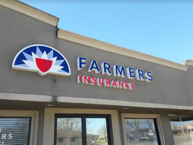
When you need to insure your life, home, business, car, boat, or RV, you head to the Vincent Strother Farmers Insurance Agency at 413 Meyer Street in Suite B. With a combined three decades of experience in the business, the friendly staff at this office works hard to ensure that you get the right policy to meet all your needs. When the company’s management team contacted our business sign specialists, it needed help with rebranding signs for insurance agencies in Sealy, TX. Because Farmers Insurance had undertaken a nationwide rebranding process that now presents its iconic logo with a more contemporary flair, our client had to change the signage at the location to meet the business’ brand standards. When we met with the team to discuss the scope of the project, we narrowed down three distinct product update requirements. Building sign. Window graphics. Hanging panel sign. Replacing an Old-fashioned Neon Sign with a Modern LED Channel Letter Setup In the past, internal neon lighting was a standard in the industry. But because LEDs are so much more long-lived and economical to operate, the majority of business clients now move to these products. The insurance agency was no exception. We removed the old sign and properly disposed of it. Next, we designed, manufactured, and installed the new channel letters that are internally lit with LEDs and perfectly encapsulate the new brand message. Bringing Window Graphics up to Brand Standards As you might imagine, the window graphics and associated lettering that the client had in place no longer met the standards of the company’s new branding. Since we were already working...
by mike | Apr 5, 2017 | Industry News, Recent Projects
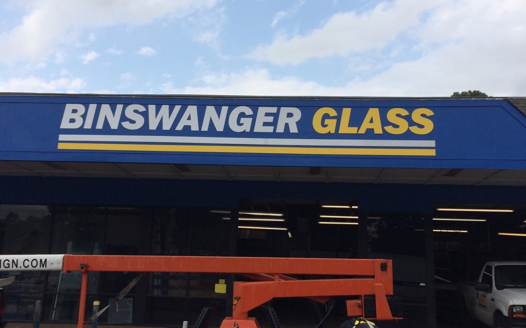
The tagline, “The Place for Glass,” identifies Binswanger Glass at 1724 FM 1960 in Houston, TX. The firm serves residential and commercial customers with products ranging from shower enclosures over auto glass to business storefront windows. When the company’s management team selected the business sign experts at Monarch Sign & Graphics to handle the location’s building sign updates and cabinet sign refacing in Houston, TX, we met with our client on site. Surveying the Challenge and Formulating a Plan Many of the exterior signage products that were at the location had lasted past their useful lives. Sign facings had yellowed and lettering presented with faded and cracked displays. The building’s electrical cabinet sign showed evidence of significant erosion. As we uninstalled the item, we noticed that the fascia boards had rotted and created structural problems. Would these issues deter us from renewing the great looks of the company’s business location? No! In fact, we dove right in. But because we realized that we could not uninstall and replace all the signage components at once – after all, the client needed to have some signage identifying the venue – we worked in stages. We first set our eyes on the pylon sign. Freshened Colors, Updated, and Replaced Signage Now Define the Business’ Location The pylon’s overall color was faded. We prepped the structure and painted it with a rust-inhibiting product that matches the blue color of the corporate palette. While our technicians focused on this task, our graphic artists prepared the flex face replacements for the sign itself. They present the company’s name and brand message to motorists...


Recent Comments